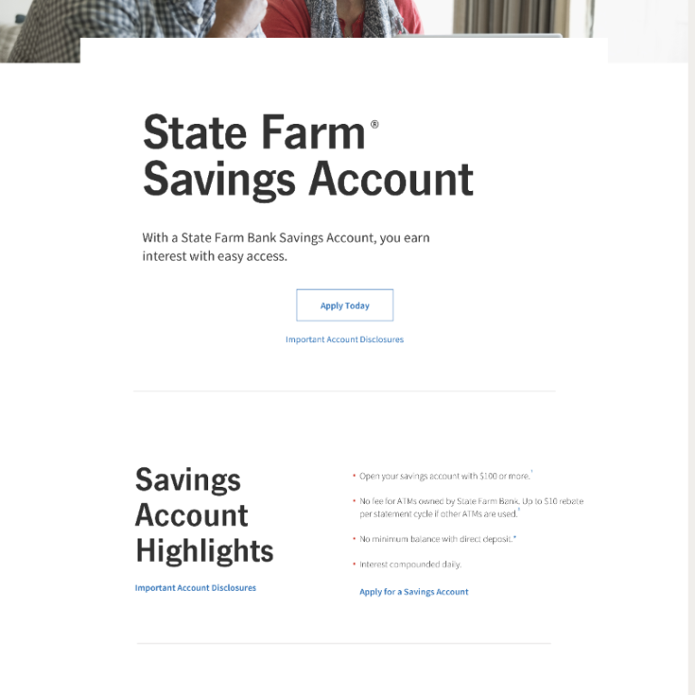
State Farm’s website had grown into a collection of disjointed informational pages. While it provided product details, the experience was fragmented, overwhelming, and difficult for users to navigate. For potential customers, shopping for insurance or banking products felt intimidating, and many struggled to find the information needed to make confident decisions. The challenge was to transform this complex ecosystem into a structured, intuitive, and engaging digital experience that simplified research, supported decision-making, and built trust.
Mission
Turn the complicated process of exploring insurance and banking products into a simple, guided, and even delightful experience—helping users learn, compare, and take action without being overwhelmed by jargon or unnecessary complexity.
UX Process
1. Research & Discovery
- Conducted heuristic reviews of existing landing pages to identify usability pain points.
- Analyzed customer journeys and common tasks (e.g., learning about auto insurance, opening a checking account).
- Gathered insights from competitive benchmarking to understand best practices in simplifying financial decision-making.
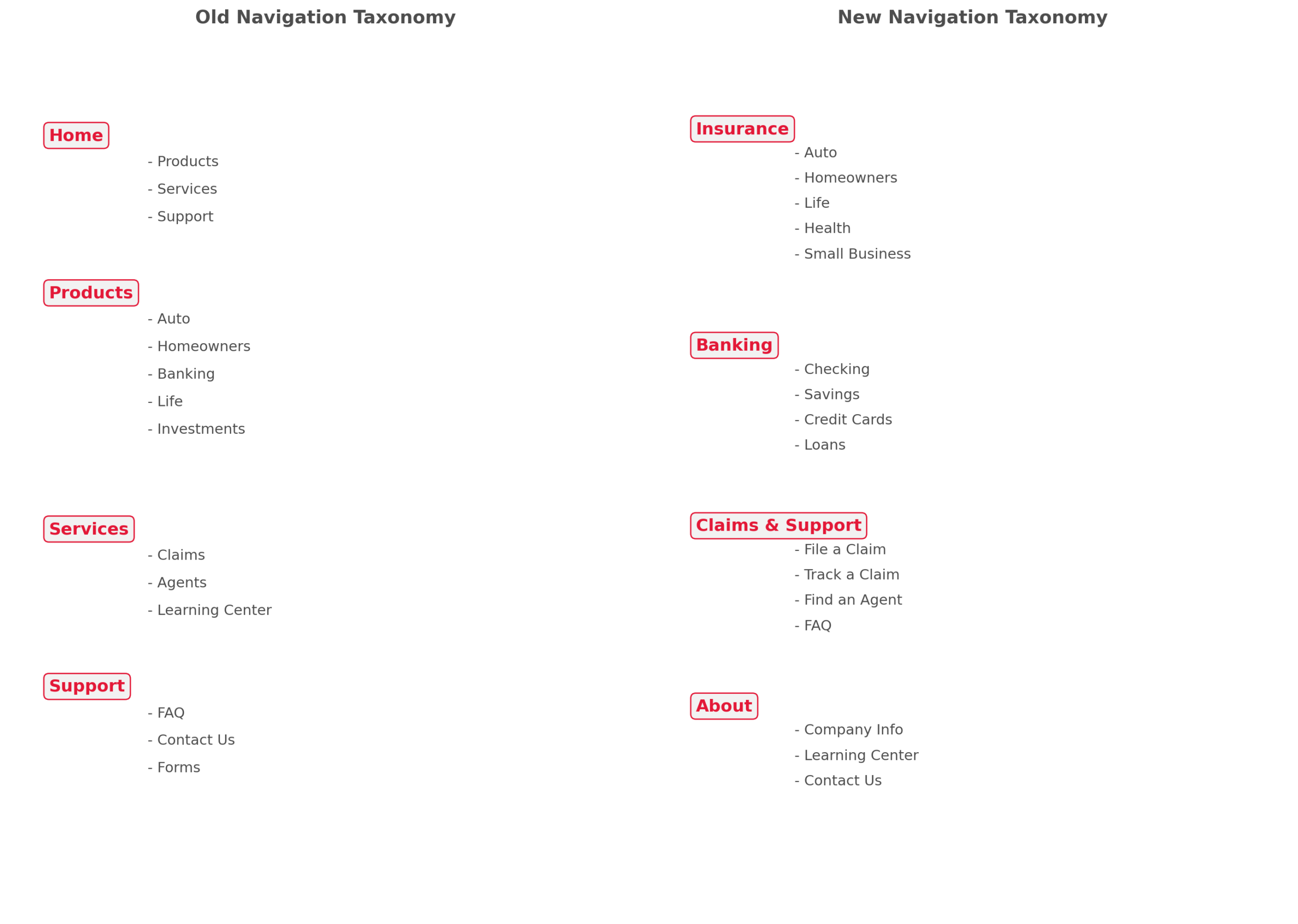
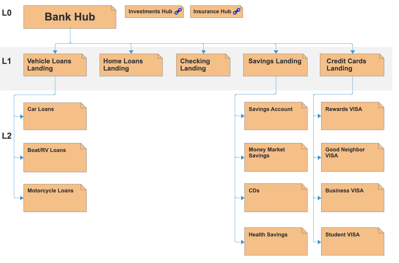
2. Information Architecture
- Reorganized landing pages into a clear content hierarchy.
- Broke down complex product information into digestible chunks, each focused on one subject at a time.
- Mapped out customer journeys to ensure pages aligned with real user goals and decision-making paths.
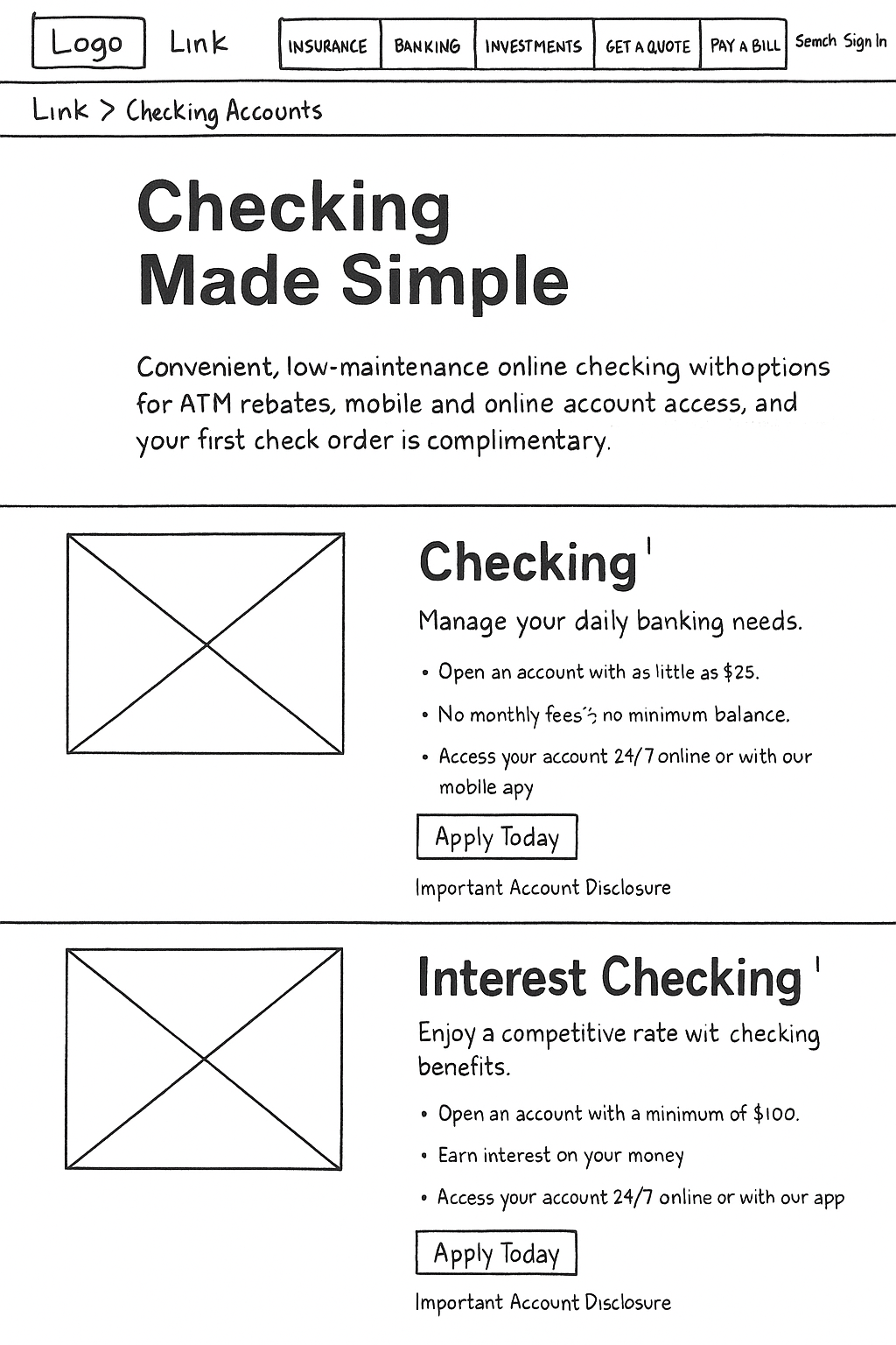
3. Wireframing & Prototyping
- Created low- to mid-fidelity wireframes that tested different ways of structuring product content.
- Introduced modular content blocks that could be reused across multiple product categories.
- Designed flows that supported both exploratory browsing (learning about products) and task completion(quoting, claims, or applications).
4. Usability Testing
- Ran iterative user tests to validate comprehension and ease of navigation.
- Adjusted content layout, visual hierarchy, and calls-to-action based on feedback.
- Confirmed that users were able to complete tasks faster and felt more confident in their understanding of products.
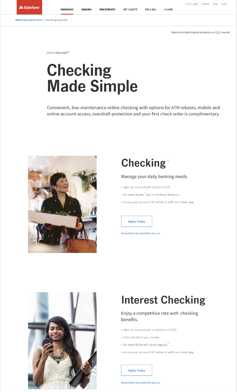
5. Visual Design & Implementation
- Applied State Farm’s brand system while refining typography, iconography, and layout for clarity.
- Ensured a responsive design so the experience was consistent across desktop and mobile.
- Partnered with product and engineering teams to bring designs into production.
Outcome
The redesigned State Farm website evolved from a patchwork of informational pages into a structured, user-centered platform. Visitors could now easily navigate content, understand complex products step by step, and execute tasks with confidence. By aligning content architecture with user journeys, the site not only improved usability but also built trust—helping potential customers make informed decisions before engaging with State Farm.