State Farm’s digital claims submission form was a lengthy, linear process that overwhelmed users and contributed to high abandonment rates. Customers reported confusion, uncertainty about required information, and a lack of guidance through the claim journey.
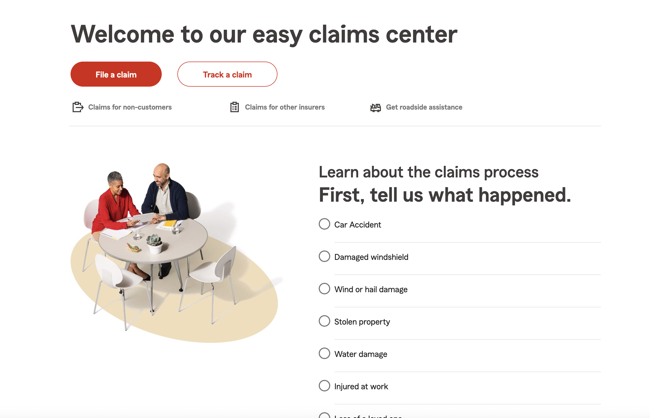
To solve this, I redesigned the experience into a conversational, guided flow that broke the process into digestible, context-aware questions — similar to how a real insurance agent would speak to a customer. This improved user completion rates, reduced cognitive load, and aligned with State Farm’s customer-first digital strategy.
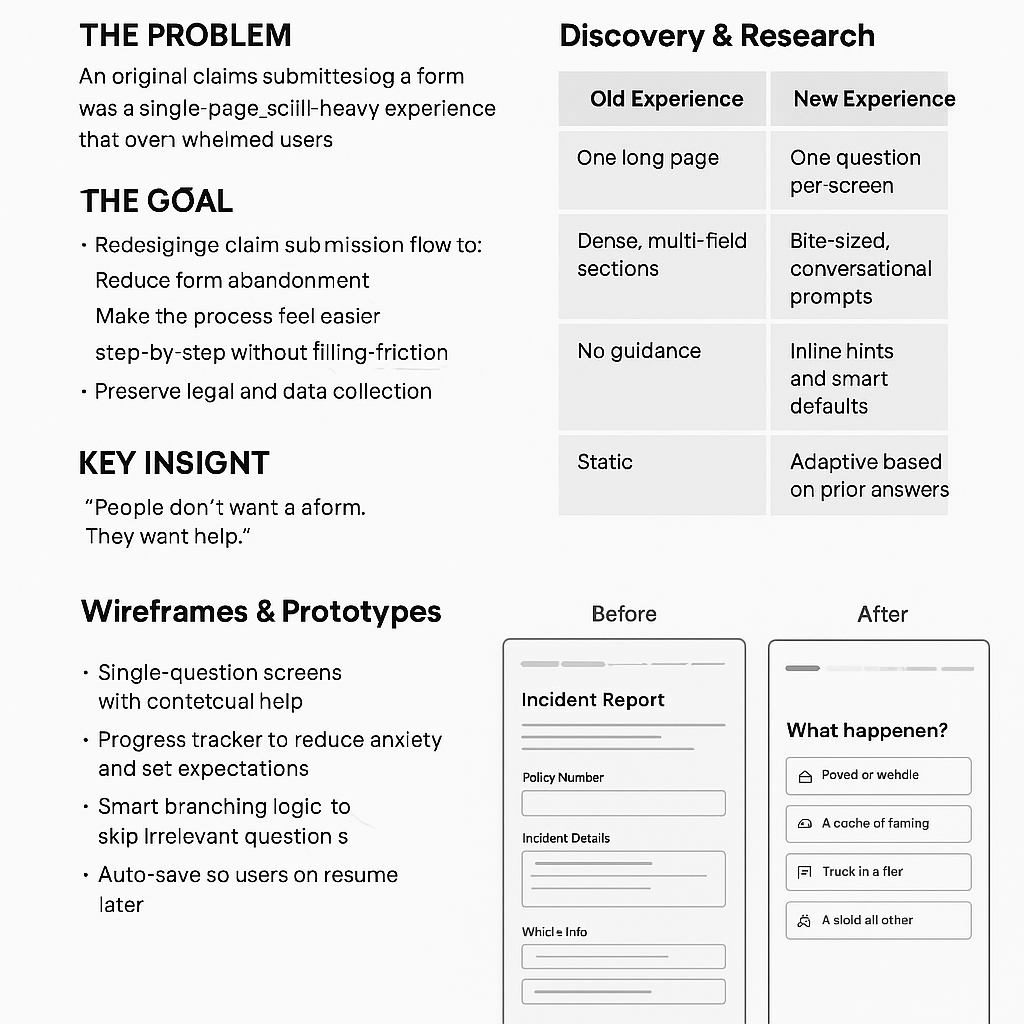
The Problem
The original claims form was a single-page, scroll-heavy experience that overwhelmed users with dozens of fields. Despite being functional, it was plagued by a 28% abandonment rate—with most users dropping off before reaching the halfway point.
Users described the experience as “daunting,” “confusing,” and “time-consuming.” It didn’t match modern user expectations for simplicity or clarity—especially during a stressful situation like filing an insurance claim.
The Goal
Redesign the claim submission flow to:
- Reduce form abandonment
- Make the process feel easier and less overwhelming
- Guide users through the form step-by-step without friction
- Preserve legal and data collection requirements
Discovery & Research
We kicked off with:
- Analytics audit: Identified drop-off zones, mostly mid-way through the form (especially at multi-field sections like “Incident Details” and “Vehicle Info”).
- User interviews: Spoke to 8 recent claimants. Common themes:
- “I didn’t know how much I had to fill out.”
- “Too many things on one screen.”
- “I got stuck and didn’t know what to put.”
- Competitor benchmarking: Looked at Lemonade, Geico, and Root Insurance. They used simplified, chat-like or progressive disclosure models.
Key Insight
“People don’t want a form. They want help.”
This insight drove our shift from a form-based mindset to a conversational UX approach—breaking the experience into a friendly, guided question flow.
Design Strategy
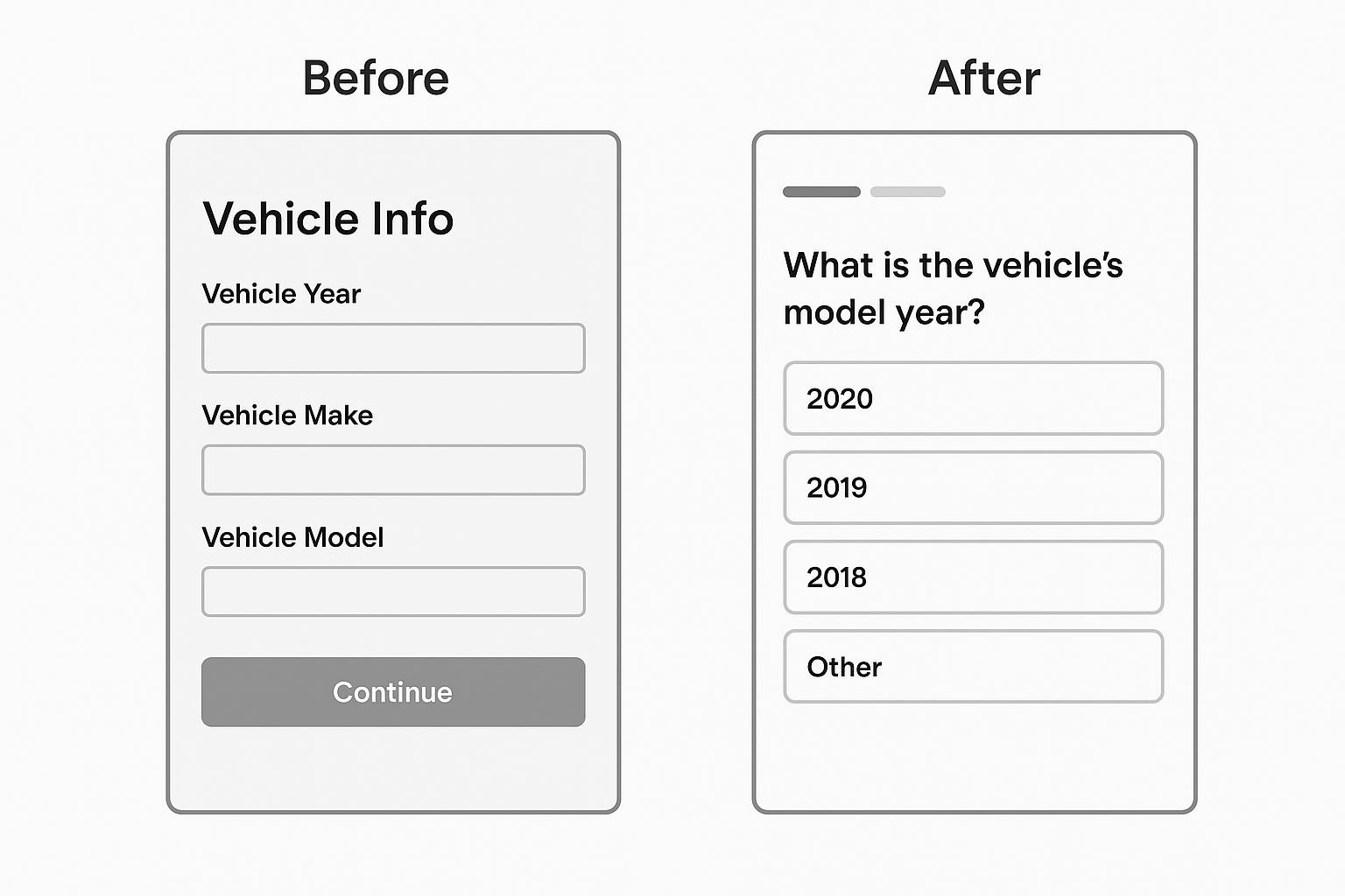
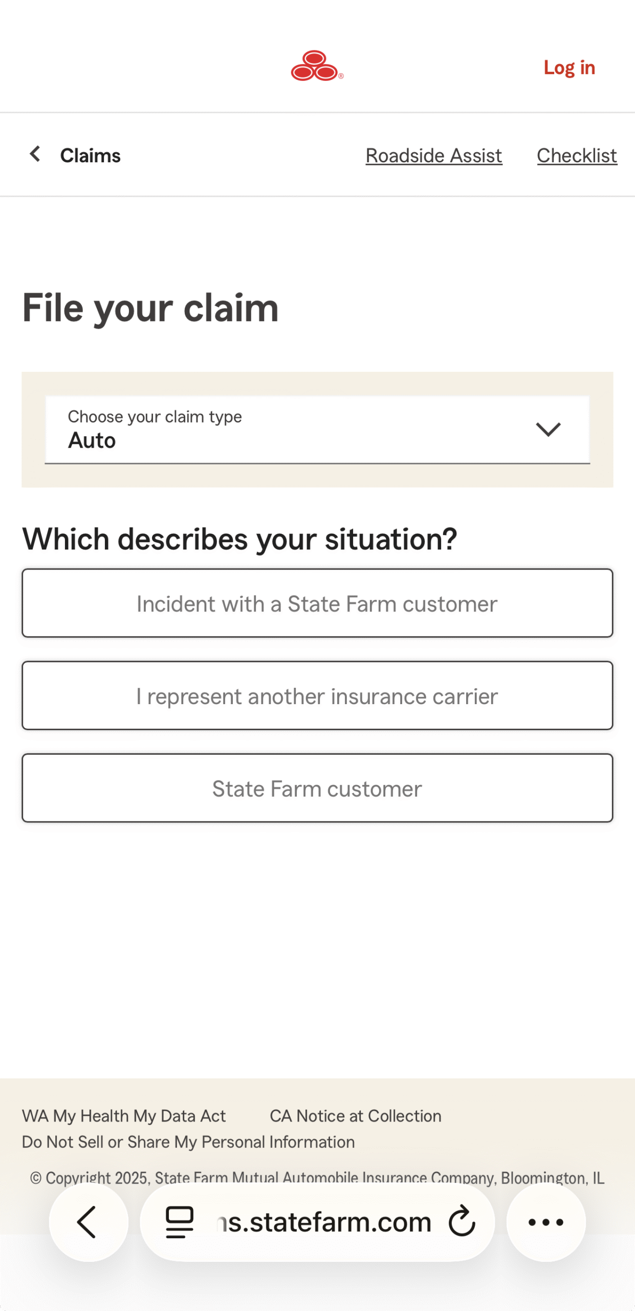
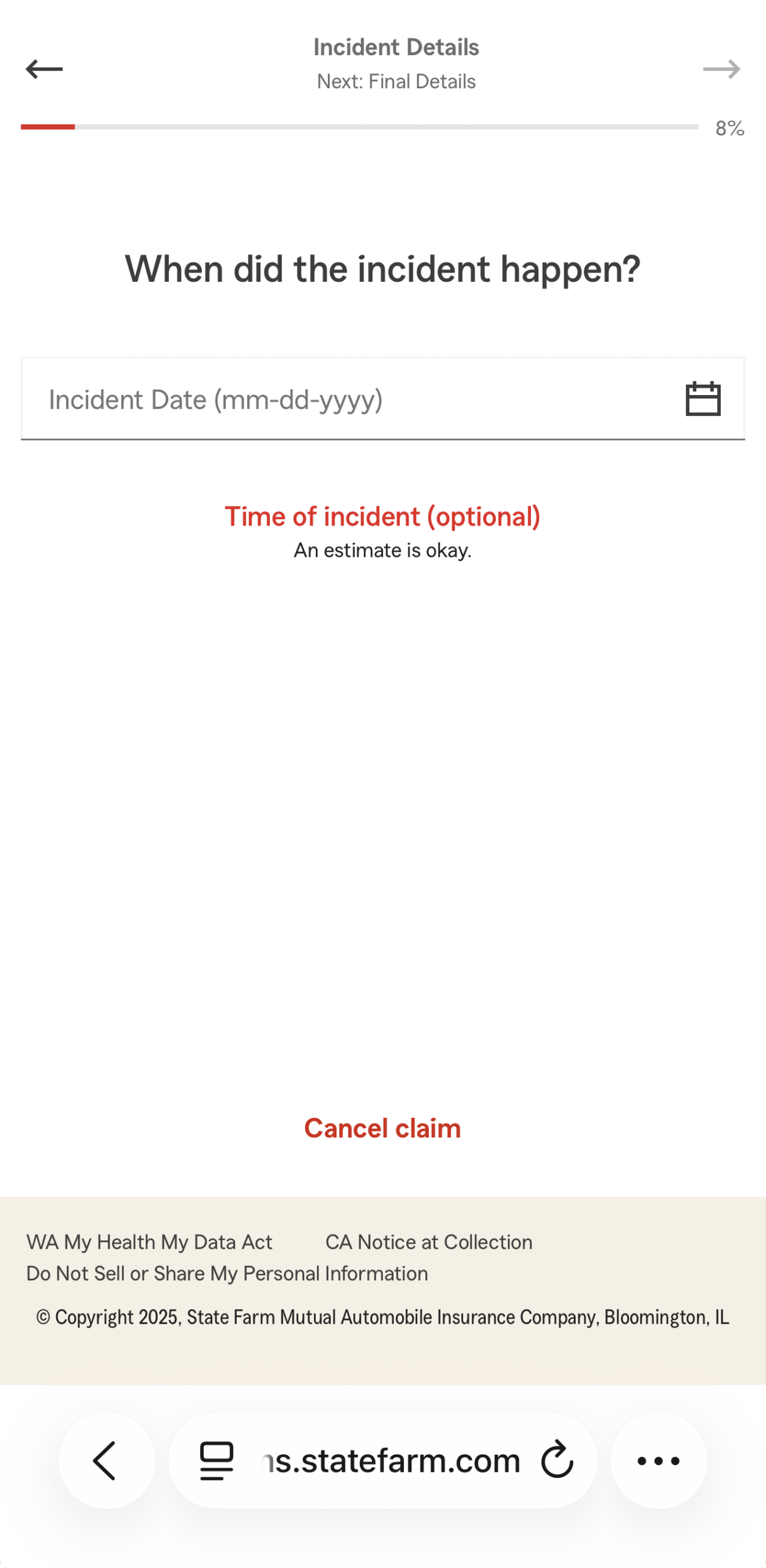
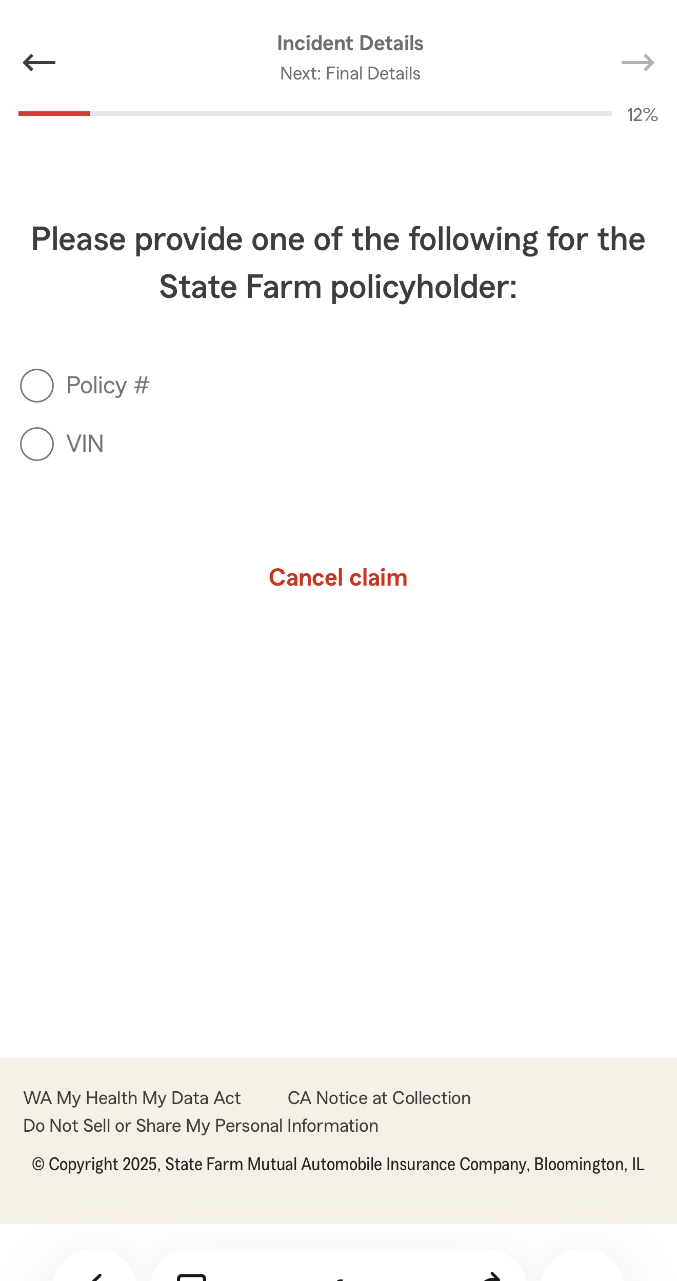
We replaced the static form with a dynamic, conversational flow:
| Old Experience | New Experience |
|---|
| One long page | One question per screen |
| Dense, multi-field sections | Bite-sized, conversational prompts |
| No guidance | Inline hints and smart defaults |
| Static | Adaptive based on prior answers |
Key features of the redesign:
- Single-question screens with contextual help
- Progress tracker to reduce anxiety and set expectations
- Smart branching logic to skip irrelevant questions
- Auto-save so users can resume later
Wireframes & Prototypes
We started with low-fidelity sketches to test flow concepts, then moved to interactive Figma prototypes.
Design Considerations:
- Tone: Professional but empathetic
- Language: Simplified, plain English
- Visuals: Clean UI with plenty of white space
- Mobile-first: Over 60% of users were mobile
Usability Testing
We tested with 6 users (3 on mobile, 3 desktop). Tasks: file a simulated claim using both the old and new experiences.
Findings:
- 100% of users completed the conversational flow
- Average completion time dropped by 35%
- 5 out of 6 users preferred the new flow
- Comments included:
- “It felt more like someone guiding me.”
- “I didn’t get stuck like I did on the old one.”
- “It was way less stressful.”
We iterated based on feedback, improving:
- Button placement for thumb reach (mobile)
- Clarifying language for a few questions
- Enhancing the progress indicator
Outcomes
Post-launch metrics (3 months after release):
- Abandonment dropped from 28% → 9%
- CSAT scores on the claims experience rose by 22%
- Time to complete decreased by 30% on average
- Mobile NPS rose from 42 → 61
What I Learned
- Small chunks reduce cognitive load—breaking forms into small steps made a huge difference.
- Conversational UX ≠ chatbot—users don’t want to chat with a robot; they want clarity and structure.
- Empathy matters—people filing claims are stressed. Simplicity, guidance, and tone make all the difference.
Next Steps
We’re now exploring:
- AI-assisted answers for easier data entry (e.g., pulling vehicle info from a photo)
- Voice input for accessibility
- Integrating progress sync across devices
Final Thought
This project wasn’t just about redesigning a form. It was about removing friction at a moment when people feel most vulnerable—and turning a stressful task into a manageable, guided journey.